Royal New York – Brand
Royal New York imports green coffee, tea, and hosts education courses for coffee and tea purveyors—big and small—east of the Mississippi. They approached Netplus wanting to differentiate themselves from their west coast counterpart, and unify their three business segments under one brand and develop a website experience that would capture and convert a diverse audience.
Before
After
To get a better understanding of the client’s vision, I lead a workshop where I presented them with three mood boards (shown below). The insights from that meeting would be crucial in defining the style guide and designing the website.
Mood Boards
An abstract approach to how Royal connects farmers and roasters the focus on blue represented the sky and sea that unites every thing.
Contrasting warm and unexpected cool tones found in places like Morocco and South America provided a fresh take that would differentiate RNY from competitors.
Warm tones and Africa represents that cozy, organic feeling people expect and look for in their coffees and teas.
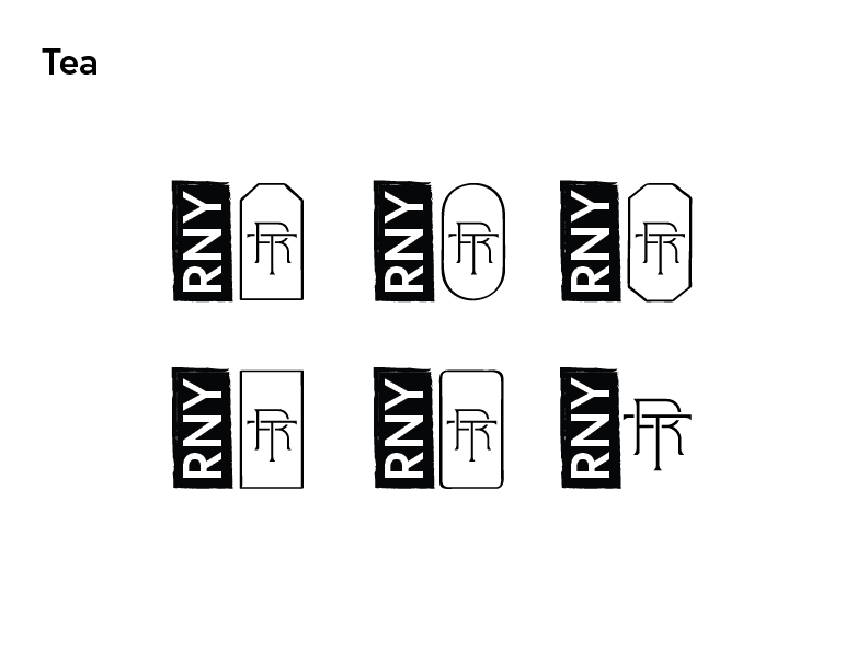
I also lead the design team in the development of the logo design process. To start, each designer reviewed the documentation of the discovery phase, and then was free to explore all of the possibilities. We met internally as a creative team to narrow the options down, presented several to the account managers, and ultimately refined it to three very different concepts we were confident in for the client.
Option 1
Option 2
Option 3
Refinement
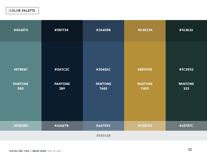
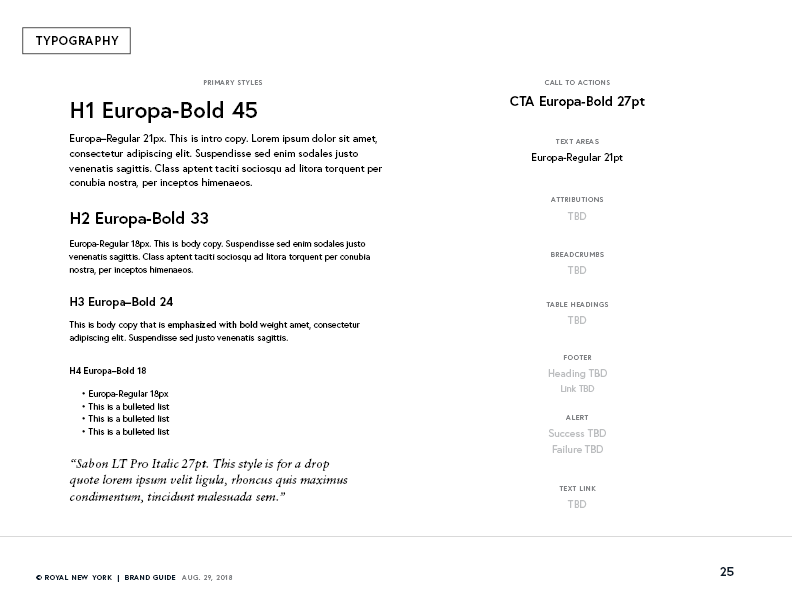
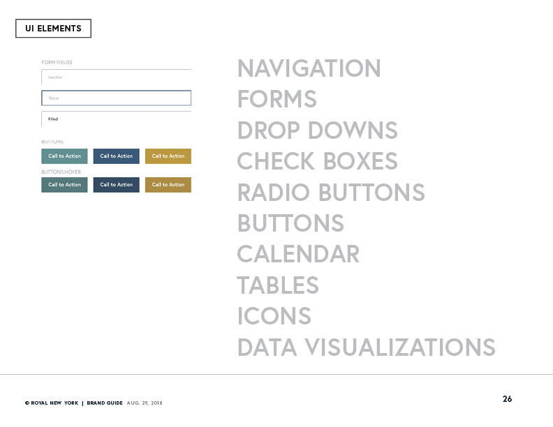
With the logo portion of the project finished, I moved on to developing and assembling the style guide to be used as the foundation in designing the website.
Agency
Netplus Marketing
Client
Royal New York
My Role
Art Direction
Branding
Creative Leadership
Design
UX/UI
Additional Team
Colleen Reese, Content Strategy & Copywriting
Amy Sachs, Copywriting
Shannon Tang, Illustration/Design
Sarah Huong, Illustration


